Once you have a property to rent out, presentation is key in attracting great tenants. Landlords with tired, shabby properties full of old, mismatched furniture are finding their properties harder to let, as tenants have more options and can be more discerning about where they choose to live.
We took on the management of this flat from a landlord who had been stuck in a bit of a time warp as not much had been upgraded since the early 90’s. As you can see from the before photos, this bedroom and living room were not presenting very well. As tenants now do most of their house hunting on line, good presentation and attractive photos are key in getting people to come and view.
Before
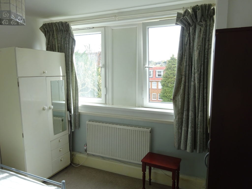
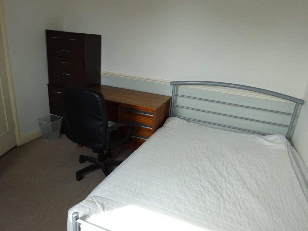
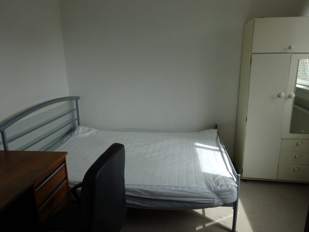
The bedroom furniture really had seen better days, and it wasn’t suited to the room. Both wardrobes were quite small, and by having two instead of one large one, they ate up too much floor space. I am also not keen on wardrobes right next to the door, as it makes the room entrance feel like a corridor, instead of being open and spacious. The position of the smaller, white wardrobe by the window also blocked the light, making the room feel smaller and darker than it was.
The other issue here was the lack of a proper dresser. 2 smaller ones had been stacked up, but were neither functional or stable, and then there was a big, ugly office desk taking up a lot of space, and totally out of place for a bedroom. The dark and mismatched furniture also made the room feel darker and smaller, when in fact it was quite a large, and very bright room.
Sometimes a room can be vastly improved with pictures and accessories, but this one needed a bigger intervention. I decided to have all the walls repainted as they were looking worn and mismatched with a different colour below the chair rail moulding on two walls. Note, although the colour was light, blues and greens are hard to cover with a lighter colour, so its best to use a couple of coats of white first, then the final colour coat. I think it took a total of 4 coats to fully cover this light blue.
The bed was fairly new and in good condition, so it stayed, but everything else had to go. The room felt so much bigger and brighter as soon as the old furniture was removed. With unwanted furniture that is still in good condition it’s worth checking with local charities whether they want it, as some will come and collect free of charge. Sadly this lot was too bad to even give away for free, so it went off to the dump.
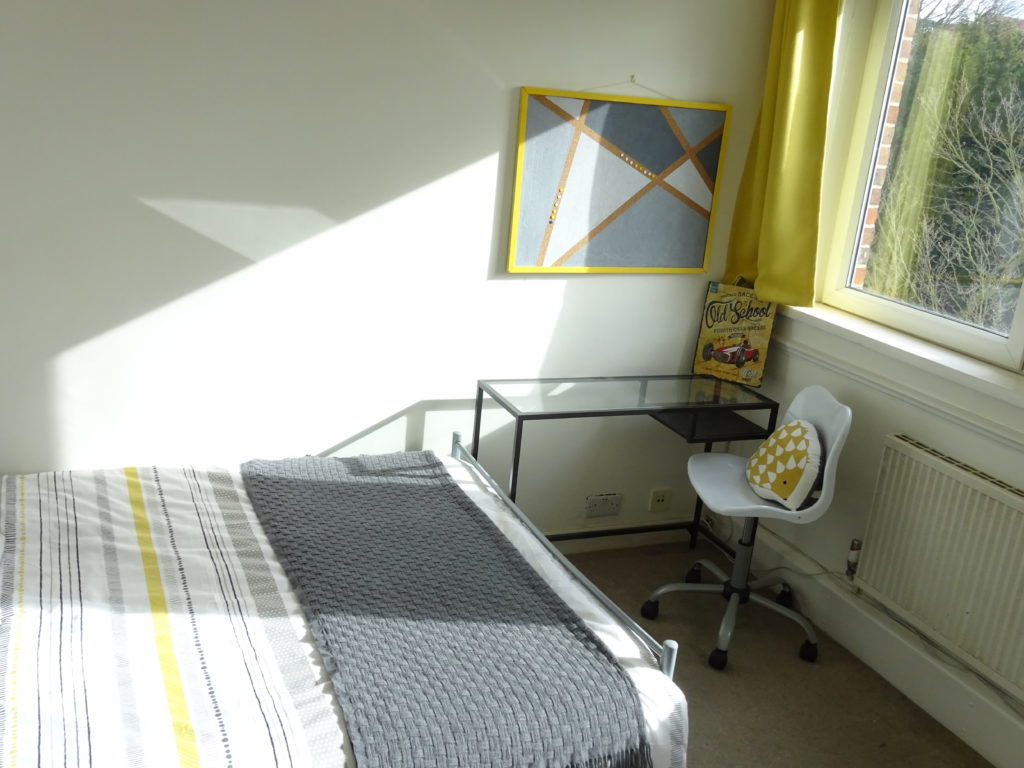
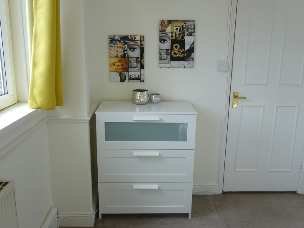
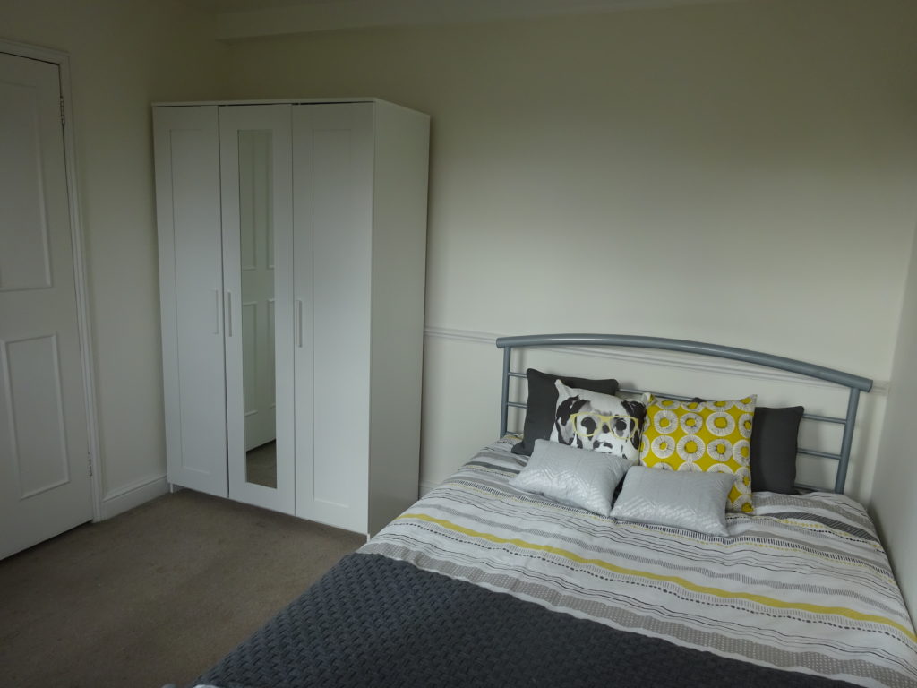
The new furniture is a bright clean white range from Ikea. I like to supply triple wardrobes, as if someone is living in a bedroom they need a decent amount of storage space. Having a long mirror as part of a wardrobe door saves money as well as floor or wall space, and helps reflect the light. Whenever possible, I like to position the mirrored wardrobe opposite or facing the window to bounce more light around the room. The glass topped desk is another favourite piece of furniture, as its light and airy, yet still provides enough study space, or room for a laptop.
Once the furniture was in, the fun part began, and that’s styling the space. An empty room with a bare mattress really doesn’t photograph very well, so dressing the bed is the absolute minimum that needs to be done for photography and viewings. I added a few pictures and accessories to make the room feel more lived in. You don’t want to over furnish or dress it, as spacious and clutter free is best, but a room does need to have a bit of personality for a prospective tenant to be able to visualise themselves living there.
After
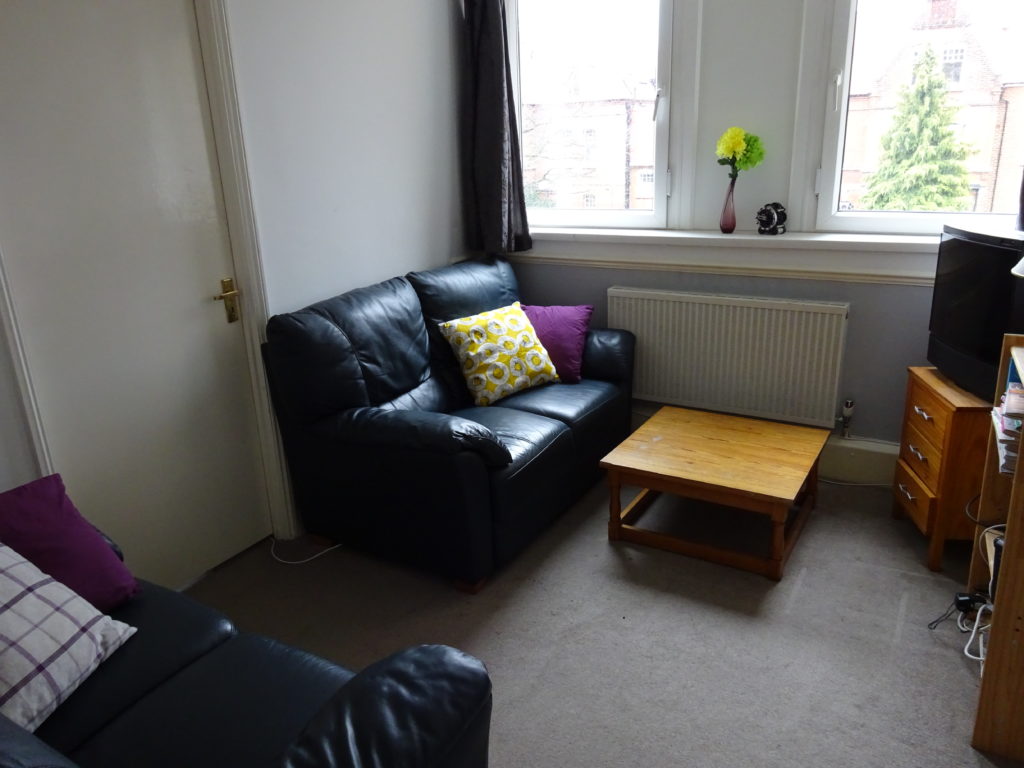
The living room wasn’t as bad in terms of furniture. The two sofas were comfortable, leather, and still in decent condition. The coffee table on the other hand, took up a lot of floor space and looked shabby, so it had to go. The rest of this transformation was simply in the accessories, again adding pictures for a bit of personality, and some bright, coordinating cushions and throws for a more inviting space.
Before
After
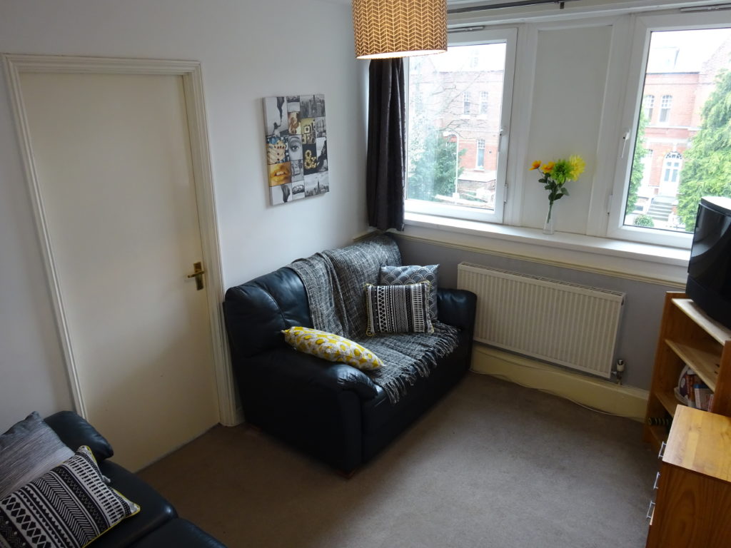
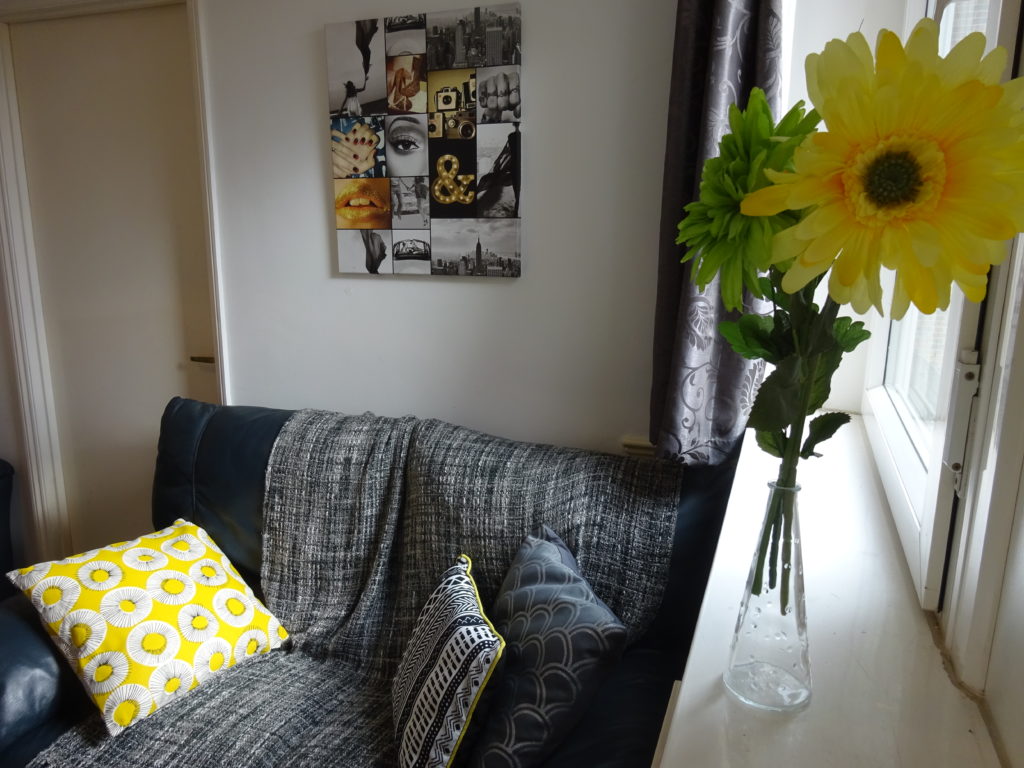
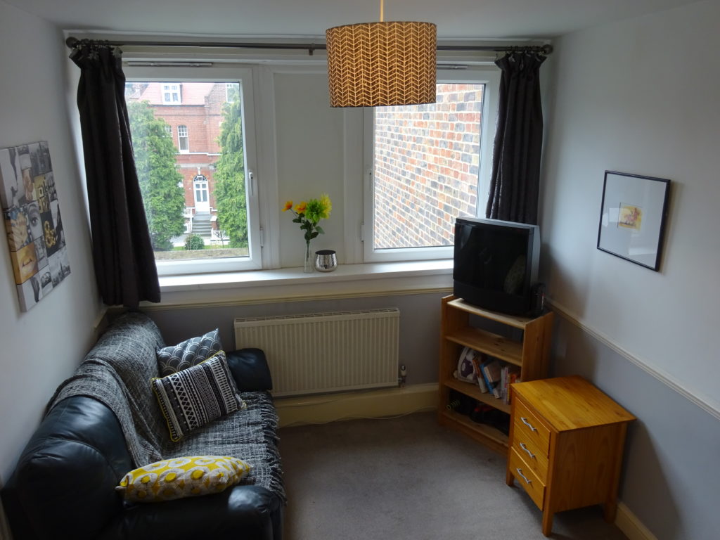
I hope you agree that a bit of thought given to the room layout, as well as fresh paint, decent furniture and a few accessories have made a world of difference.
